Signal Extraction · Deep Dive

From Chaos,
Patterns Emerge

Every SEC filing is a wall of legal text. Thousands of sentences, hundreds of disclosures, infinite ambiguity. We extract 164 binary signals from each filing and plot them across time. From the noise, the truth reveals itself.


The Process

How we transform filings into insight

Each quarterly report (10-K, 10-Q) flows through a four-stage pipeline. No human reads every sentence — but every sentence gets read. The result: a time series of binary signals that reveals what companies are really saying beneath the boilerplate.

📄
SEC Filing
Raw 10-K and 10-Q reports from EDGAR. Legal prose, financial tables, risk factors. Thousands of pages per company.
🔬
164 Classifiers
Binary questions applied to every sentence. "Is this a going concern warning?" "Is revenue growing?" Yes or no, no ambiguity.
📊
Scatter Plot
Each classifier becomes a data point per filing. 7 distress signals × 30 filings = 210 red dots. The sea of data forms.
📈
Regression Line
Fit a line through the chaos. The slope tells the story — is distress rising or falling? The pattern emerges.
The key insight: Individual data points are noisy. A single "going concern warning" in one filing could mean anything. But when you plot 7 distress classifiers across 30+ filings and fit a regression line, the trend becomes undeniable. You're not reading tea leaves — you're reading the actual trajectory of corporate health.

The Classifiers

14 signals that separate distress from recovery

We use 7 distress signals and 7 recovery signals, each normalized by document length. The resulting "signal intensity" is comparable across companies and time periods.

Distress Signals

  • going_concern_warning — auditor doubts about survival
  • financing_desperation — emergency capital raises, dilution
  • below_expectations — missed guidance, disappointing results
  • revenue_declining — shrinking top line
  • cautious_or_hedging_tone — management uncertainty
  • negative_outcome — setbacks, failures, rejections
  • uncertain_timeline — delayed milestones, slipped schedules

Recovery Signals

  • strategic_financing — well-structured capital raises
  • non_dilutive_financing — grants, partnerships, royalties
  • above_expectations — beat guidance, positive surprises
  • revenue_growing — expanding top line
  • positive_outcome — wins, approvals, milestones hit
  • improvement_versus_prior — better than last period
  • pivoting_successfully — strategic repositioning working

Case Studies

Three companies, three trajectories

The scatter plots tell stories that earnings calls can't hide. Each dot is a classifier firing in a specific filing. The regression line cuts through the noise to reveal the underlying trajectory.

iRobot (IRBT) — The Decline

Net Health: −49 → +28
iRobot distress scatter chart
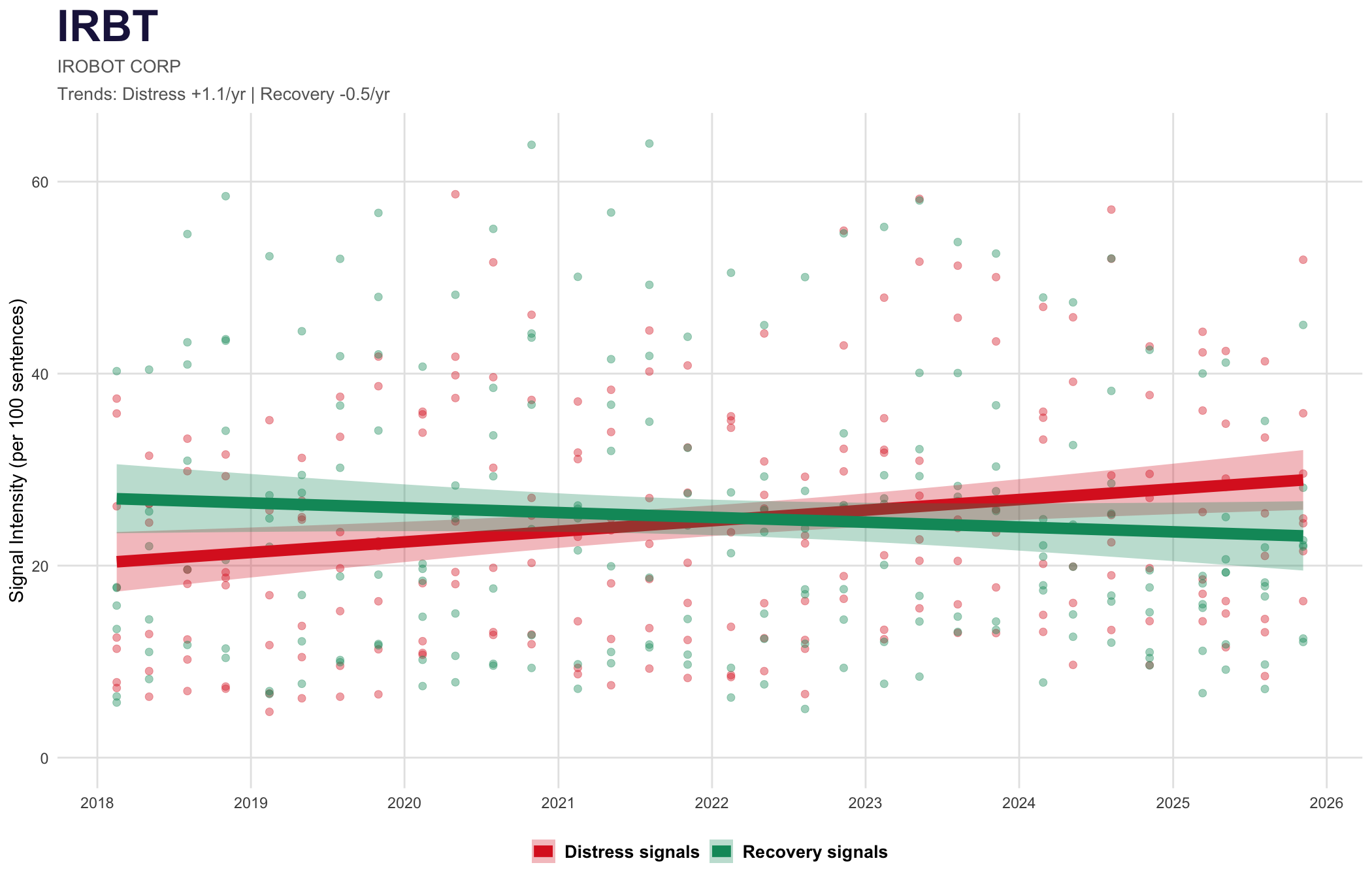
Once a healthy company (recovery signals dominated in 2018-2021), iRobot's trajectory reversed dramatically. The red regression line is now climbing while green falls. The Amazon deal collapse and subsequent restructuring are visible in the signal shift.

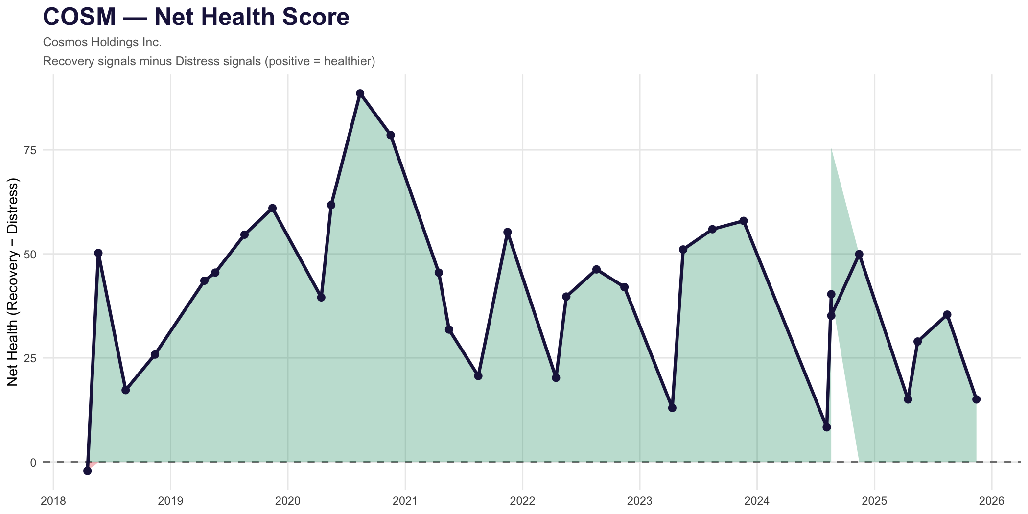
Cosmos Health (COSM) — The Turnaround

Net Health: +4 → +29
Cosmos Health distress scatter chart
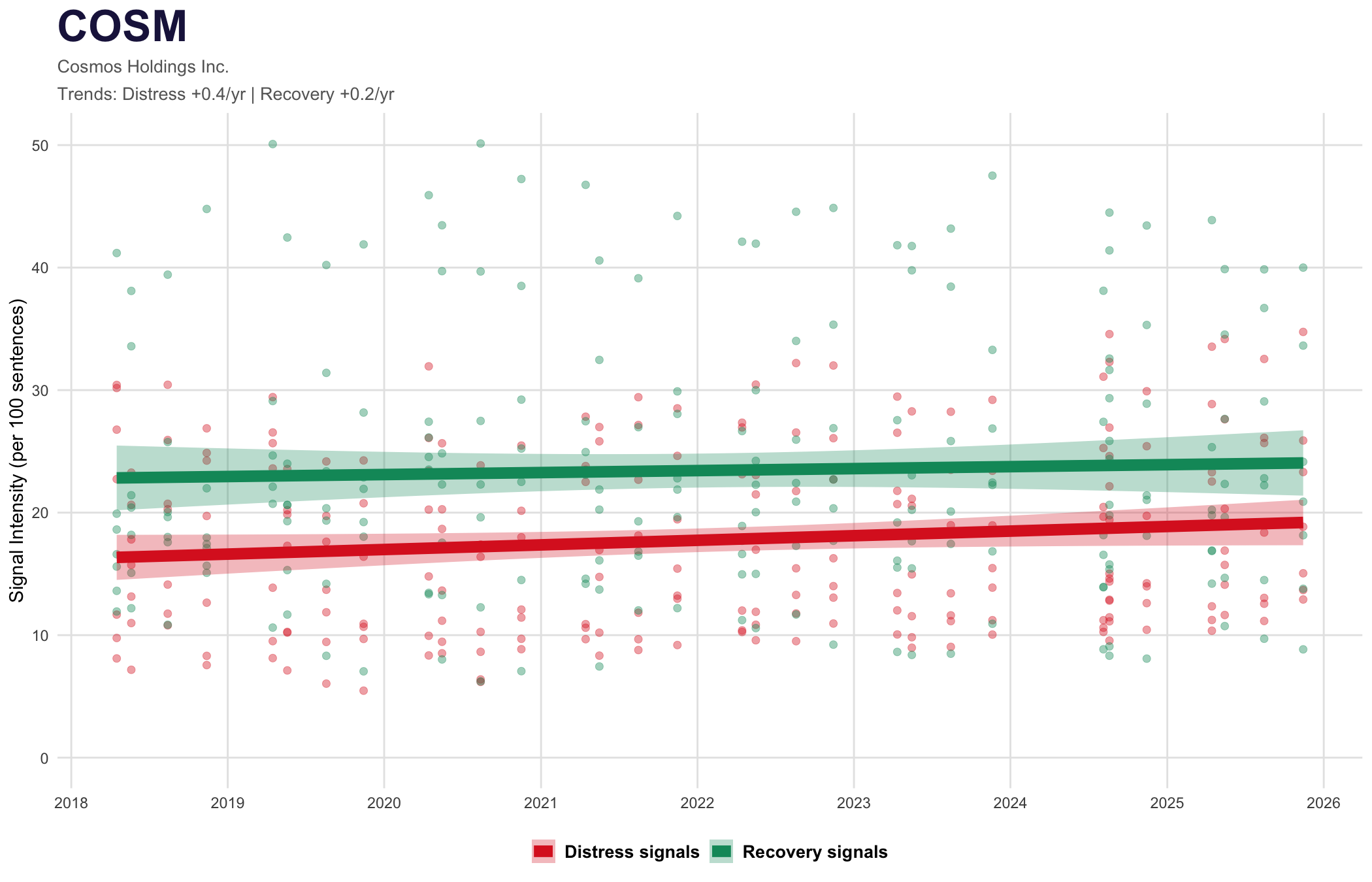
Despite showing up on distress screens, COSM's trajectory tells a different story. Recovery signals are trending up faster than distress. The green line is pulling away — this is what a turnaround looks like in the data.

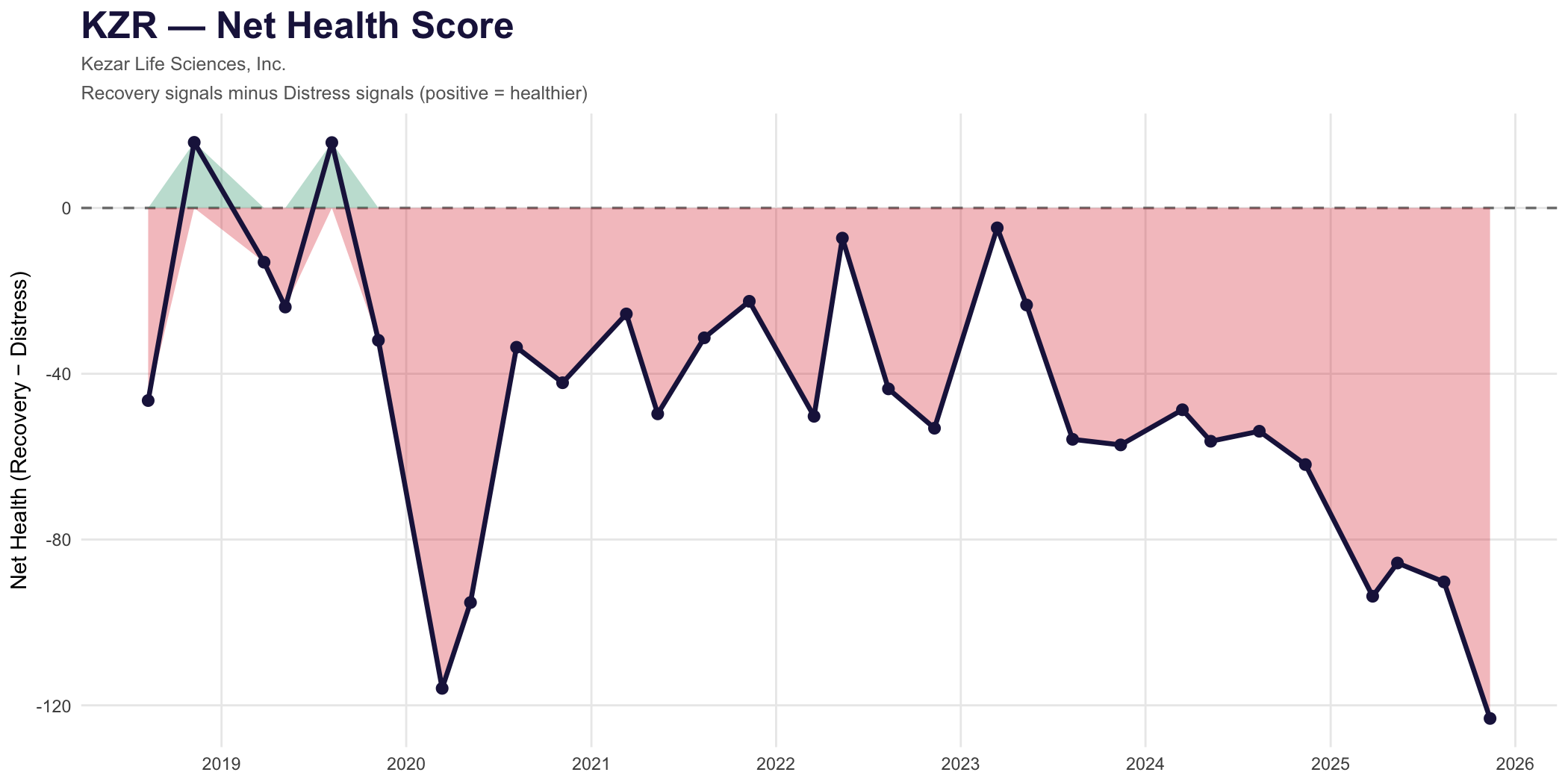
Kezar Life Sciences (KZR) — The Death Spiral

Net Health: −36 → −77
Kezar distress scatter chart
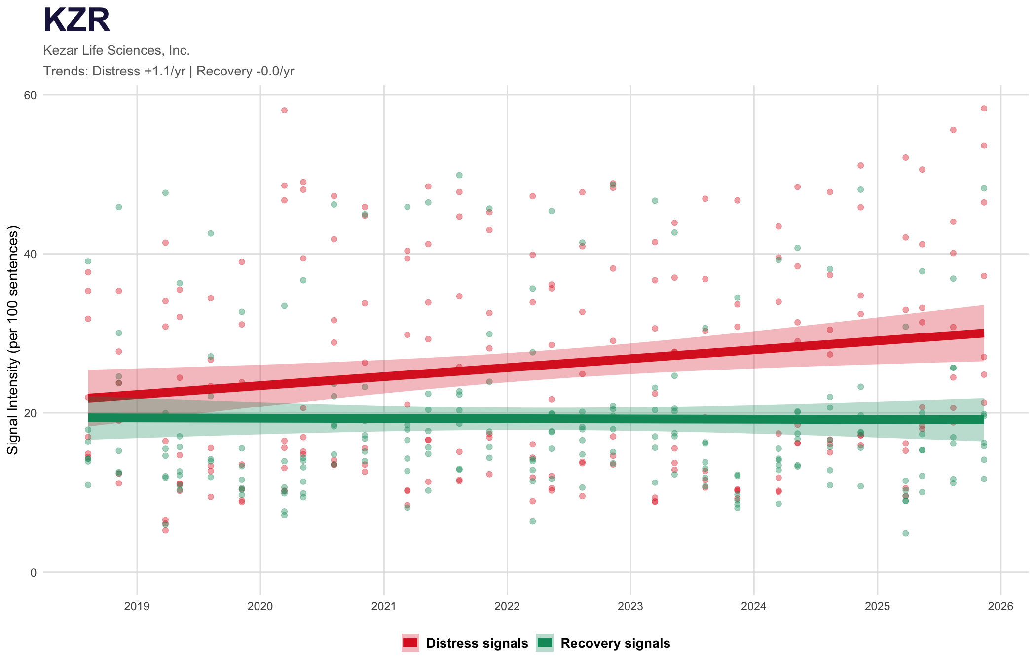
The textbook distress pattern. Red points (distress) are accelerating upward while green (recovery) stagnates. The gap between the regression lines widens with each filing. This is not noise — this is structural decline visible quarters before headlines.

The Simplified View

Net Health — recovery minus distress

Sometimes you just want one number. Net Health = (sum of recovery signals) - (sum of distress signals), normalized per 100 sentences. Positive = healthier, negative = distressed. Track it over time.

COSM net health
COSM
Cosmos Health Inc.
↑ Recovering
KZR net health
KZR
Kezar Life Sciences
↓ Declining
The area tells the story. Green fill = recovery dominating. Red fill = distress dominating. The line shows the journey. COSM spent years in distress territory but has emerged. KZR started struggling and never recovered — each quarter worse than the last.

Technical details

Normalization

All signal counts are divided by document sentence count and multiplied by 100. This creates "signal intensity per 100 sentences" — comparable across 50-sentence and 500-sentence filings.

Regression Method

Simple linear regression (OLS) fitted to all data points per cluster. The slope indicates trend direction and magnitude. Shaded confidence bands show uncertainty.

Time Period

Charts use 10-K and 10-Q filings from 2018 onwards. This captures pre-COVID, COVID, and post-COVID periods for meaningful trend analysis.

Classifier Source

Signals are extracted using fine-tuned transformers trained on labeled SEC sentences. Each classifier outputs a binary yes/no per sentence, then aggregated per filing.

Net Health Calculation

Sum of all 7 recovery signals minus sum of all 7 distress signals, after normalization. Positive values indicate recovery dominance; negative indicates distress dominance.

Data Quality

Filings with fewer than 50 sentences are excluded to ensure statistical stability. Company name changes are tracked to maintain continuity.